A summer project building a family-friendly strategy game with my son. From game mechanic sketches to a shipped iOS app, using Figma and Swift along the way.
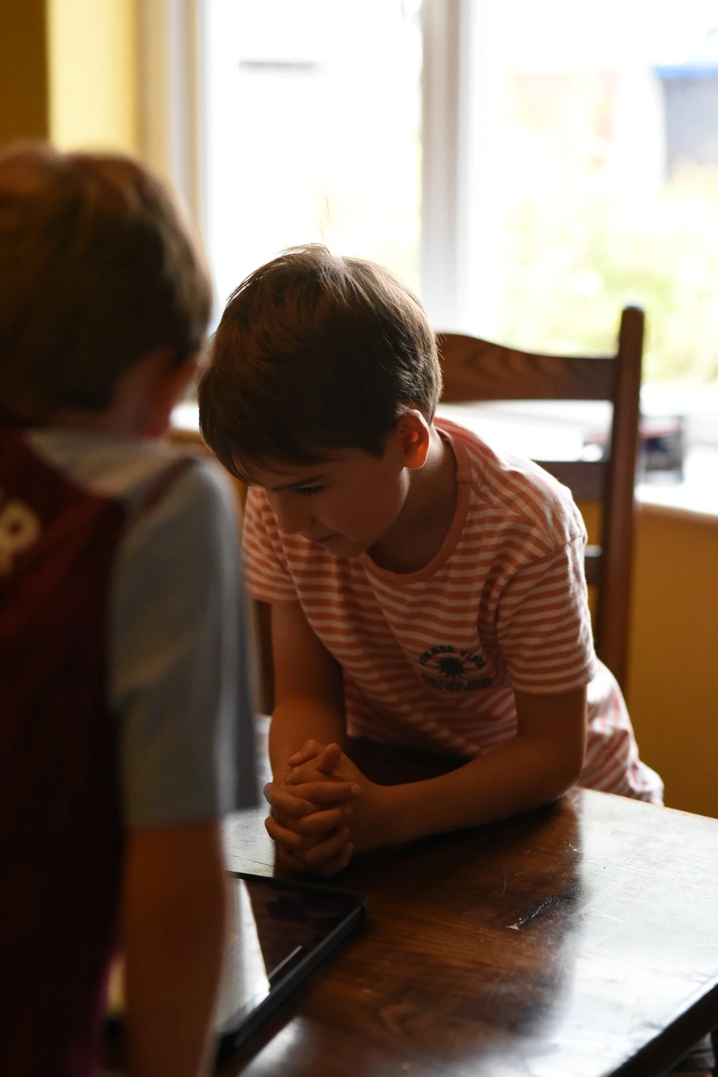
View on App StoreGames are one of the best ways for families to spend time together. Not passively, but actually engaging, arguing, laughing, making decisions. Arthur, my son, and I play a lot of both board games and video games, and I'd been looking for something we could build together rather than just play.
I'd been pushing into new territory with code. Moving beyond HTML and CSS into React and Swift, partly curiosity, partly because AI tools had made it genuinely realistic for a designer to build something real. This felt like the right moment to combine that with something meaningful. A summer project with Arthur that wasn't just a distraction, but a proper creative collaboration.
We both love Connect 4. So we started asking: what if the board had no size limit? What if there were more than two players? What if the grid was infinite? That question became Gridfinite.
Figma Make had just launched and I'd already been using it at work for high-fidelity prototyping. It was the perfect sandbox for testing game concepts quickly. We explored what an infinite grid could feel like, how players would navigate it, how turns and tile placement would work. Within five prompts we had something playable enough to reveal the real design challenges.
"Five prompts didn't give us a polished game. But they gave us a clear view of where to go next. Which is exactly what prototyping is for."
While the output was rough, it let us iterate at a pace that wouldn't have been possible any other way. Arthur would play something, tell me what felt wrong, and we'd adjust. Design, play, react, repeat. That became the rhythm of the whole project.
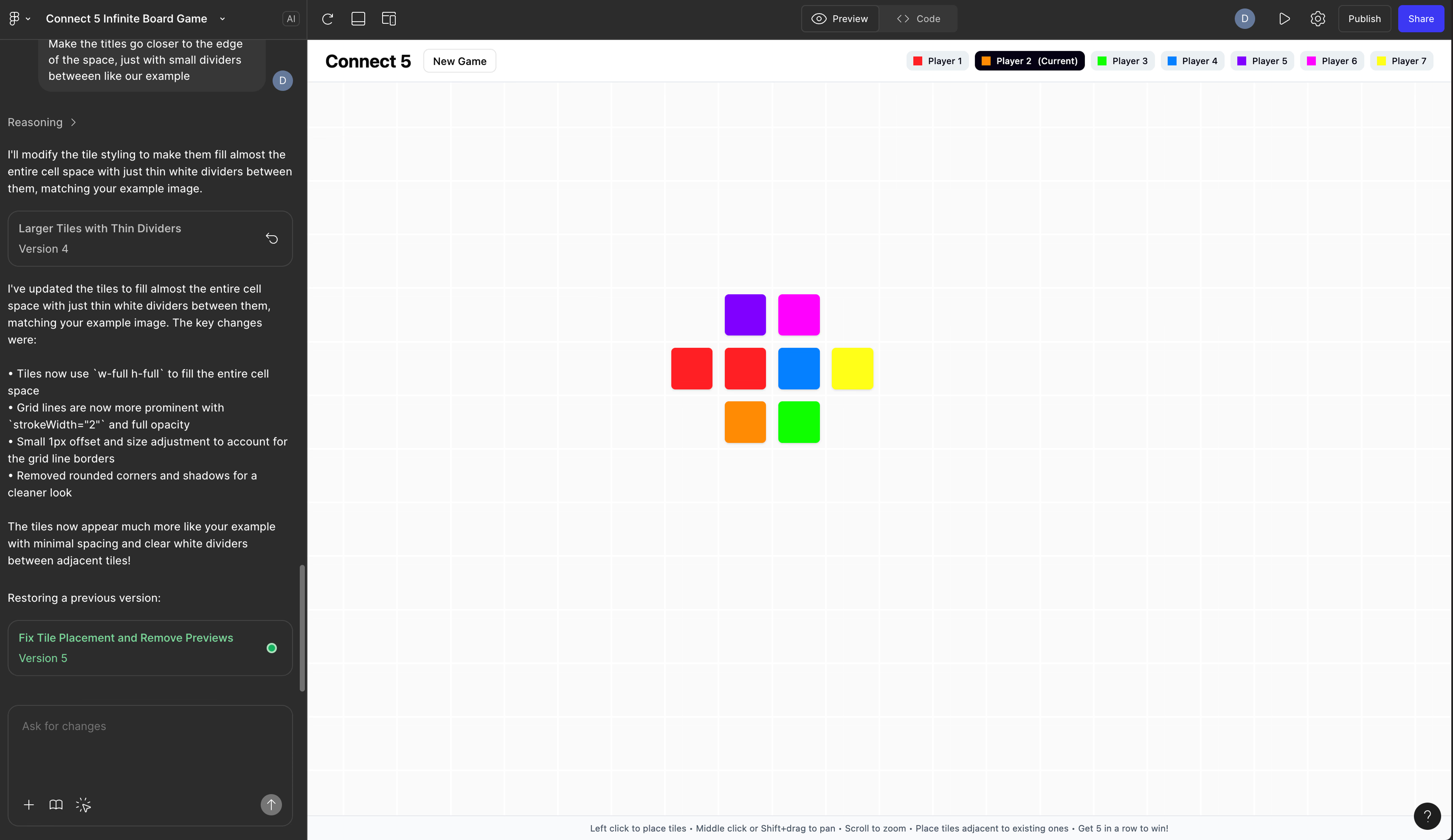
Early Figma Make prototype — five prompts in
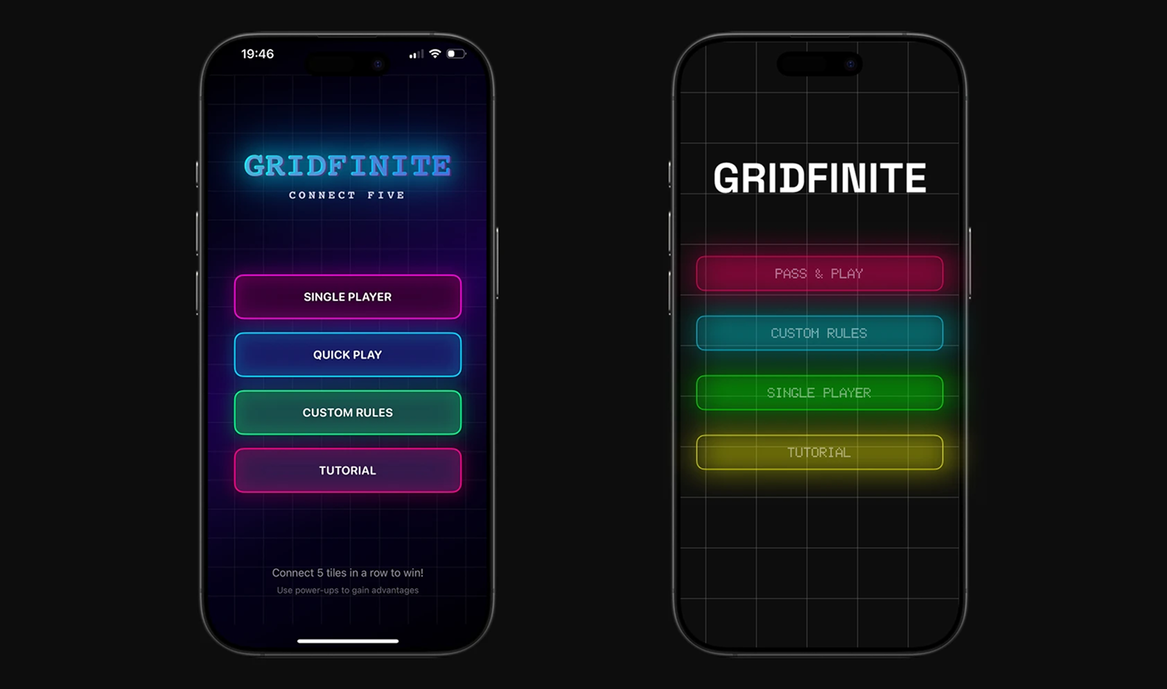
Initial menu and button concepts finding the app's feel
We started in Figma, refined the core mechanics, then set up the project in Cursor to manage the code together. The game originally began as a web app, but we quickly moved to Xcode. Native iOS gave us far more control over the experience and access to the things that make mobile games feel good: haptics, sound, smooth animation.
The build process was genuinely collaborative. I'd push for a UX change, Arthur would tell me if it was technically painful to implement, and we'd find a middle ground. Sometimes he was clearly right and I deferred to him. Other times I had to explain why something that felt fine in code would feel wrong to a first-time player.
The hardest design decision was the visual style. Cursor helped us build the mechanics, but the early designs felt generic. One day we found a glowing app that caught our attention and started exploring a Tron-like direction. I wanted something modern and restrained. Arthur wanted more glow, more vibrance, more drama.
In the end, I trusted him. At eight, he's exactly the audience this game was built for: young enough to reject anything that feels slow or confusing, old enough to articulate why. His instincts about what makes games feel exciting turned out to be exactly right. Neon edges, glowing tiles, screen-edge colour feedback for whose turn it is. That's largely his. I just made sure it stayed coherent.
The summer holidays gave us time to put Gridfinite through its paces with real people. We play-tested with everyone from four-year-olds to seventy-year-olds, in groups of two up to seven, in cafés, on trains, and anywhere we could gather a willing crowd.
Each session taught us something specific. Players would accidentally take another person's turn, so we added a preview step before tile placement. Power-ups were being missed entirely, so we increased their frequency. Then we overcorrected and had to dial it back. Some players didn't understand how power-ups worked, so we added explainer modals. Games were dragging when someone took too long, so we built an optional timer.
"The best feedback didn't come from a survey. It came from watching someone frown at the screen and trying to work out what they were confused about before they said anything."
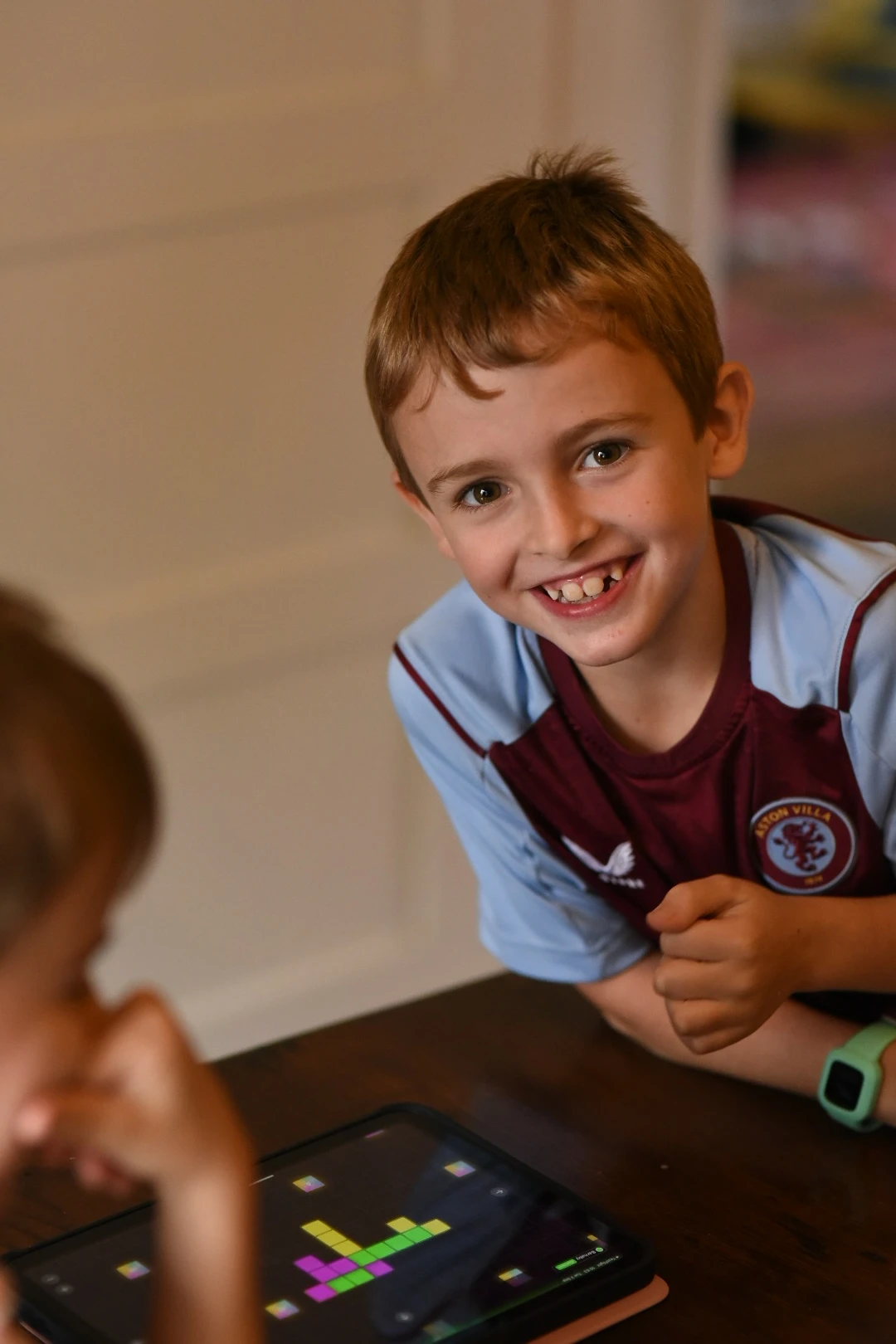
Ad hoc play-testing with Arthur and friends
Testing across different ages and group sizes
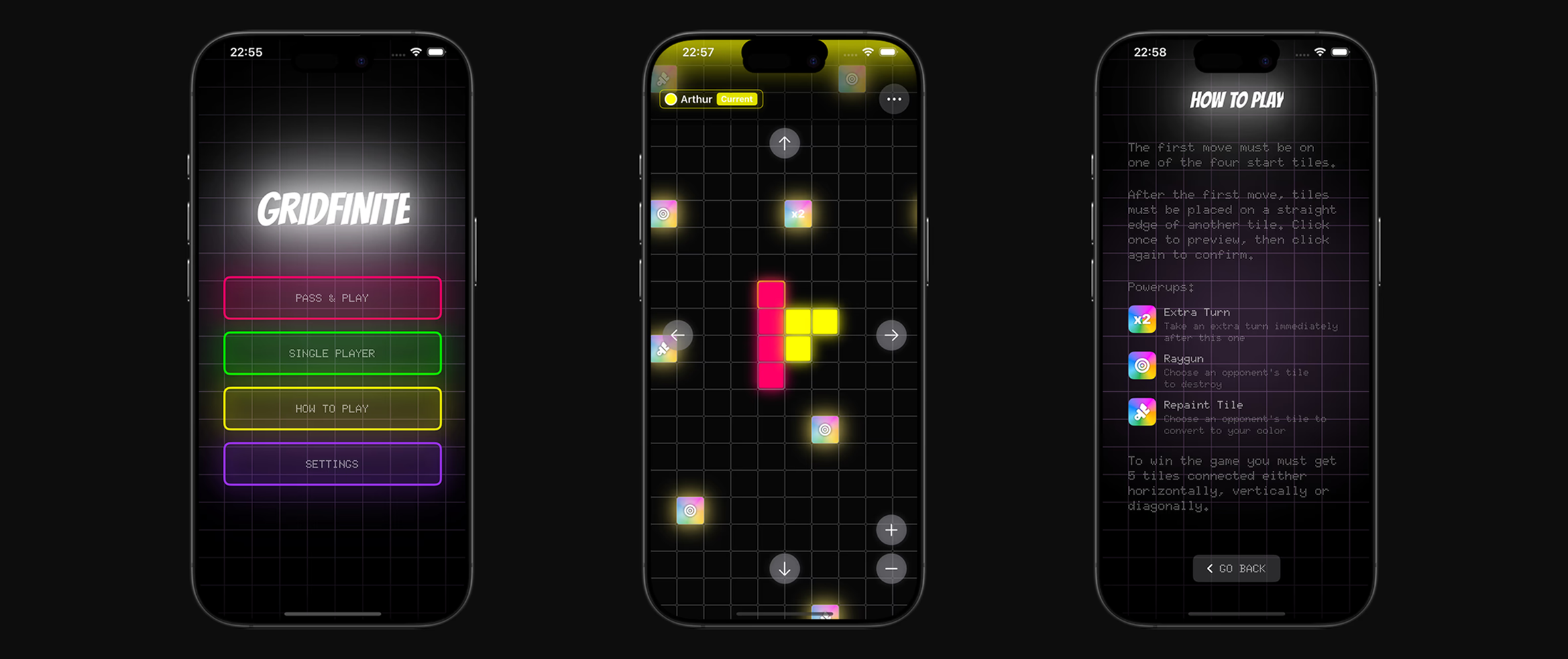
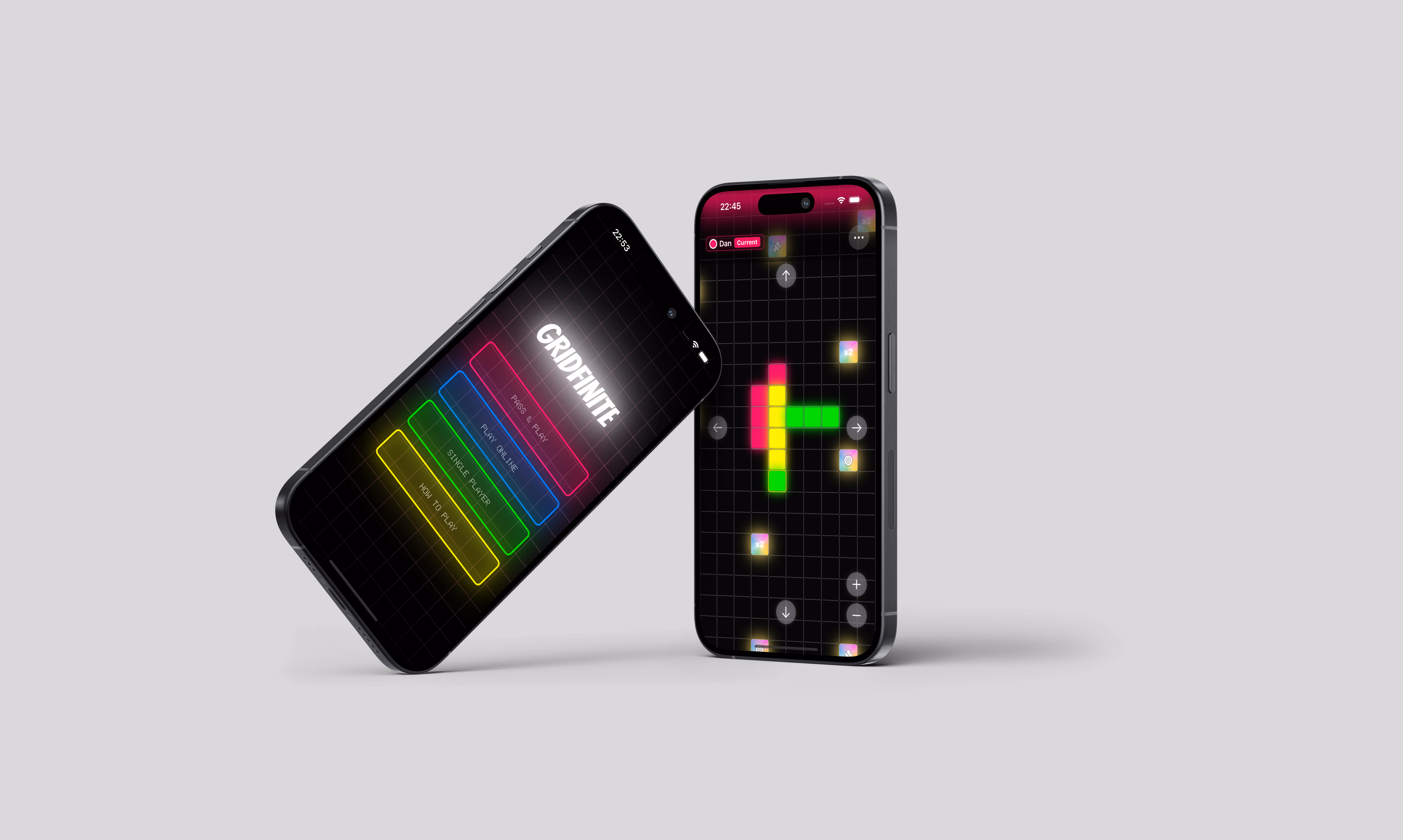
Final app screens, refined through play-testing
The last stretch was about polish. We introduced a unified menu with smooth navigation and shifting background colours that guide players through the app without them needing to think about it. We added sound effects and haptic feedback. Small things, but they make every move feel more satisfying. We expanded the winning effects and built a quick tutorial for first-time players.
We also built a single-player mode with an AI opponent, trained using Google Colab. This came directly from play-testing: solo players wanted to practice before taking on family members. It was a reminder that solving one design problem often surfaces the next one.
Gridfinite is live on the App Store. We continue to test, play, and gather feedback from everyone willing to give it a go. The next features we're looking at are Game Centre integration and online multiplayer — the natural next step for a game built around people playing together.
If I had to sum up what this project taught me: ship something real with someone you care about. It will teach you more about design, collaboration, and what actually matters in a product than almost anything else. Arthur and I are already talking about what we build next.