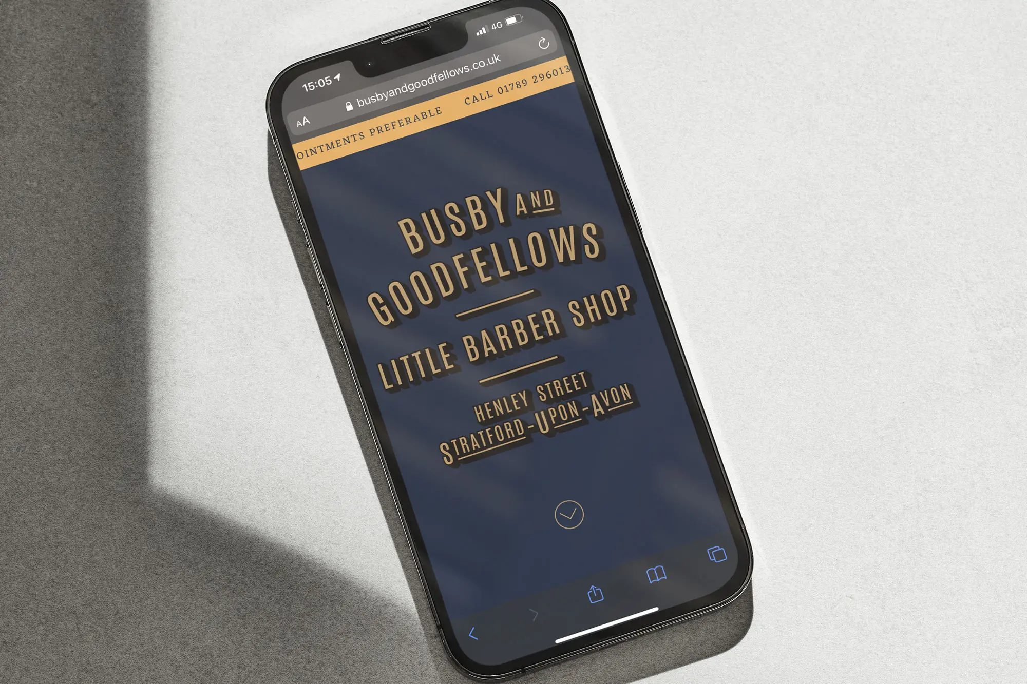
Before Next, I spent seven years freelancing for small businesses. These are three of my favourites. Each one had a strong personality, and my job was to get to know them properly, usually with a camera in hand, and bring that across in their brand and website.
Busby & Goodfellow’s is a barbershop in Stratford upon Avon run by Harry and Luke. It’s full of memorabilia, collectibles and vintage finds, and it’s as much a community hub as a barbershop. The challenge was getting that personality across online.
I built the brand around traditional serif fonts and muted colours to match the shop’s vintage feel. Luke’s dad is a writer and poet, so I worked with him on the copy, which gave it a really witty, personal tone. I shot all the photography myself, from the shop’s fittings to real conversations in the chair.
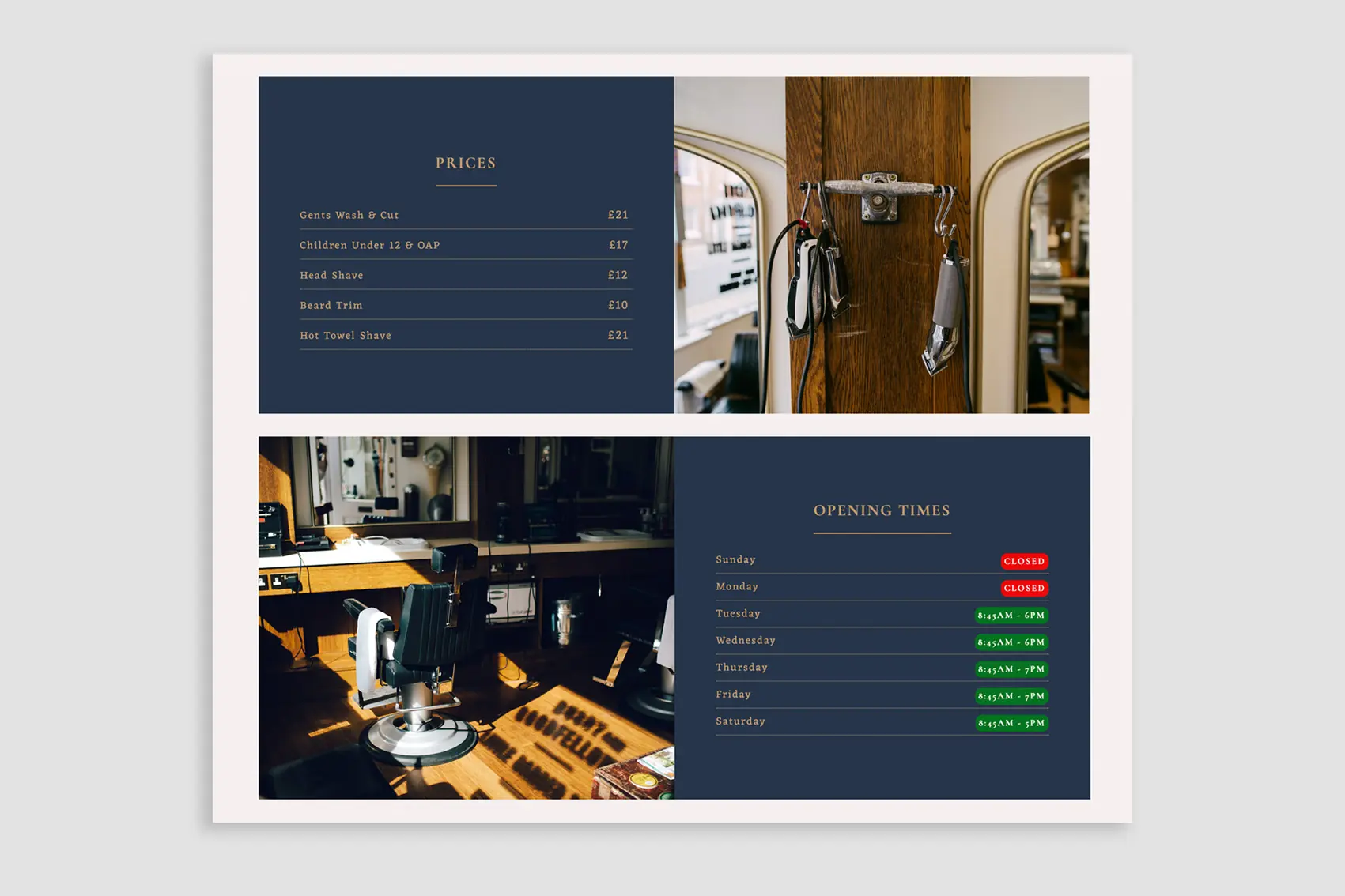
Opening times and prices up front, shaped by talking to customers in the shop
The main thing was making key info quick to find, like opening times, prices and booking. I spent time talking to customers as they came in, and that led us to a one page site with anchored navigation, so people can get straight to what they need.
There were two types of visitor to design for. Regulars, who now have a merch shop and a newsletter to sign up to, and new customers, who we wanted to move from walking in to booking ahead. We landed on a scrolling message bar prompting people to call for an appointment. I also built custom WordPress e-commerce and checkout pages.
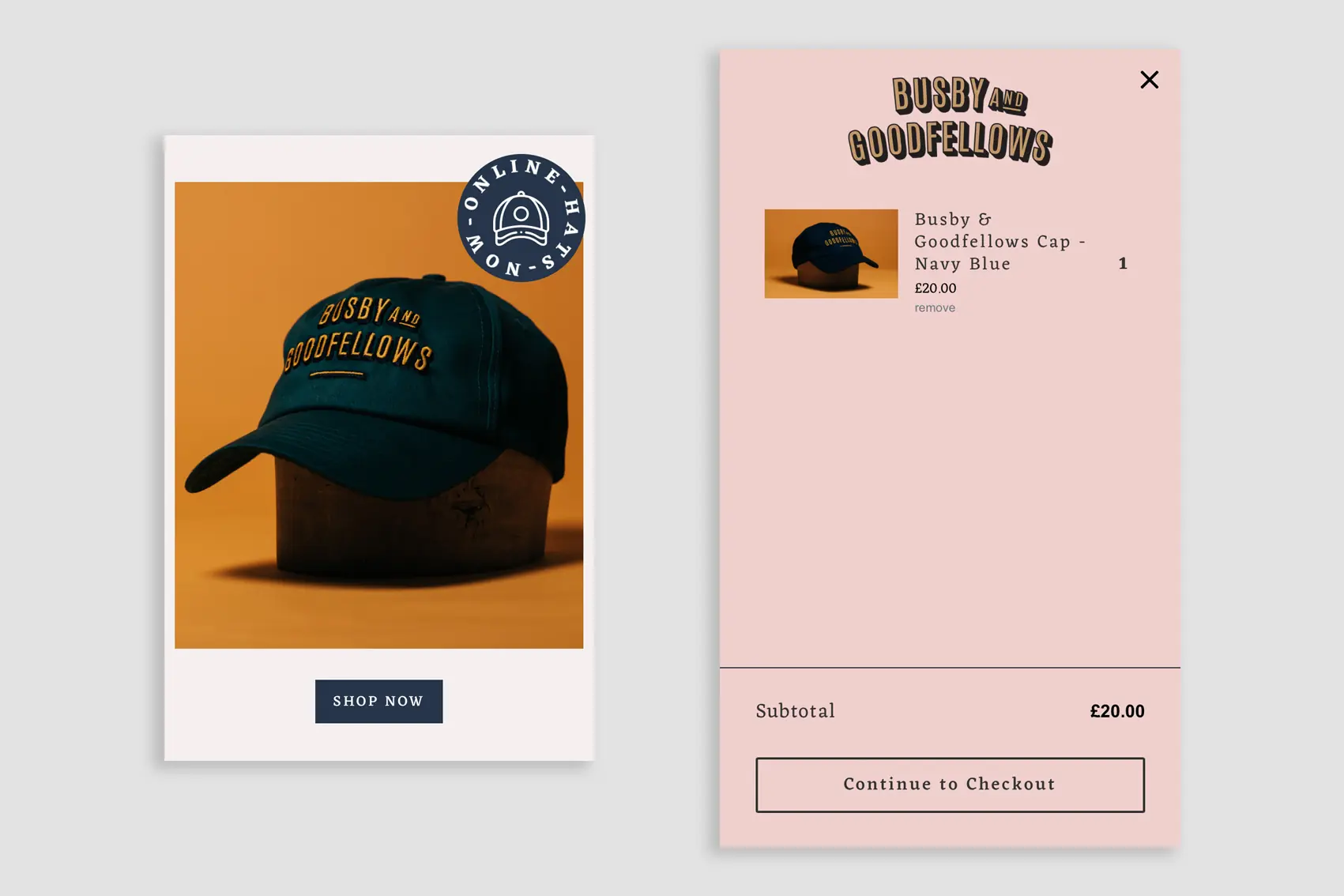
A shop and newsletter for the regulars, alongside the booking that customers asked for
It’s a great mix of the guys’ personality and modern tech that makes things easier for customers. Later on, customers started asking for online booking, so we integrated a full booking system. People can still call the shop, but it’s taken a lot of pressure off Harry and Luke, who are a little less rushed off their feet running between phone calls and the customers in their chairs.
At Home With The Rudds is a luxury homeware brand in the Cotswolds, set up by artist Samantha Rudd. I joined right at the start with a blank slate and built the whole brand, from the website and products to packaging, signage and the shops themselves.
On day one we started with a logo built from Samantha’s own sketches, then moved on to colours, fonts and photography. The style draws on traditional techniques, letterpress type, vintage photography and earthy tones, and the website changes its tones and imagery with the seasons.
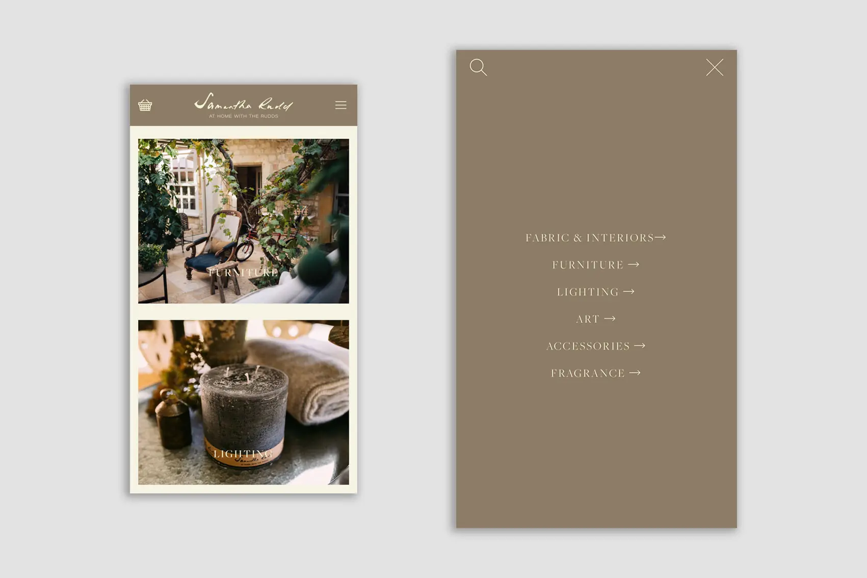
Custom mobile menus to keep lots of product categories easy to browse
For the online shop I used Webflow to build a custom Shopify theme, so we got Shopify’s point of sale with the design freedom of Webflow. There are a lot of product categories, so I designed custom desktop and mobile menus with animations to keep everything easy to browse.
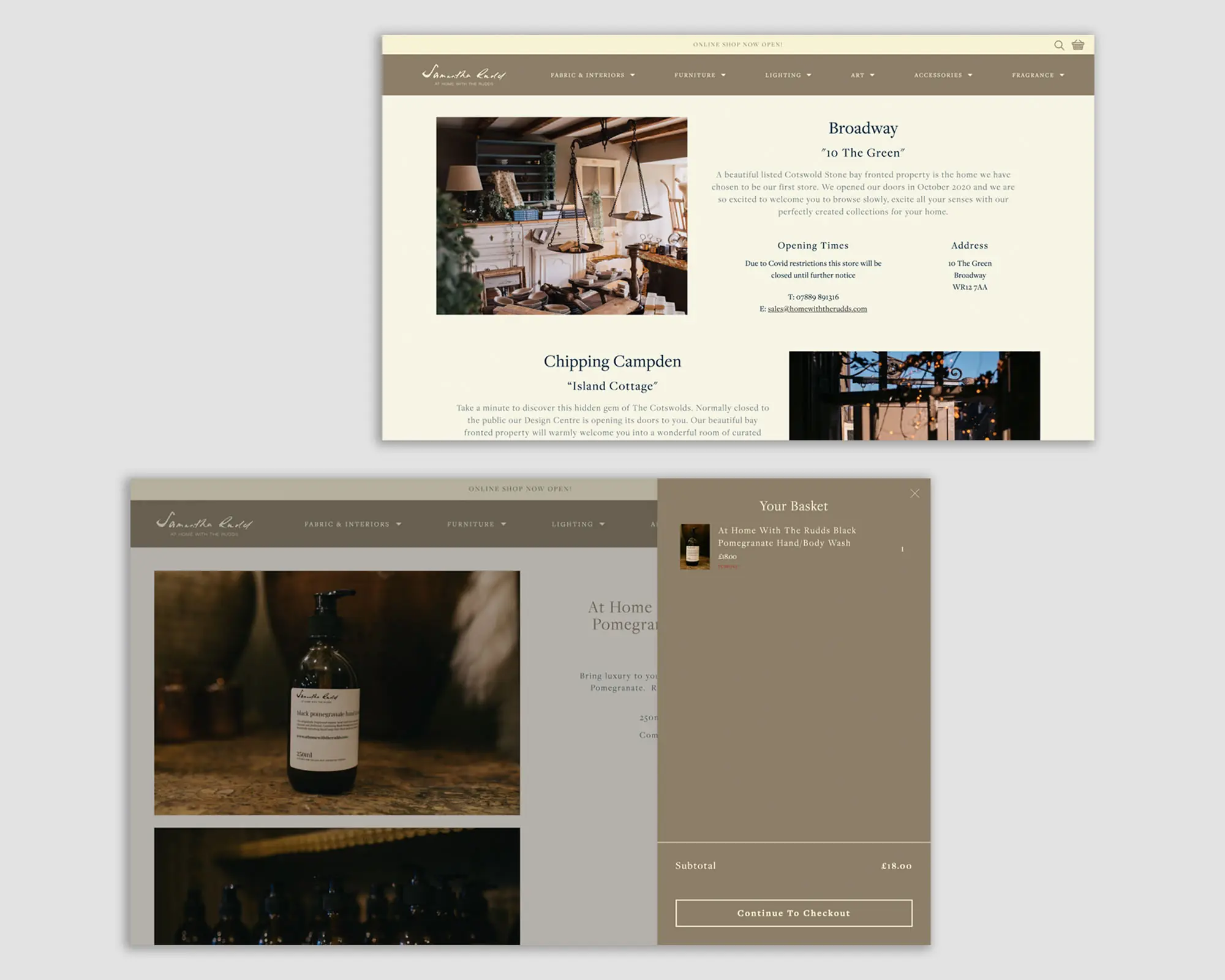
Letterpress type, vintage photography and earthy tones, changing with the seasons
I shot the product photography at Samantha’s home and garden studio in a documentary style, mixing studio and lifestyle shots. I also designed the packaging, labels and shop signage. Working on the shops, the website and the products at the same time meant everything felt like one brand.
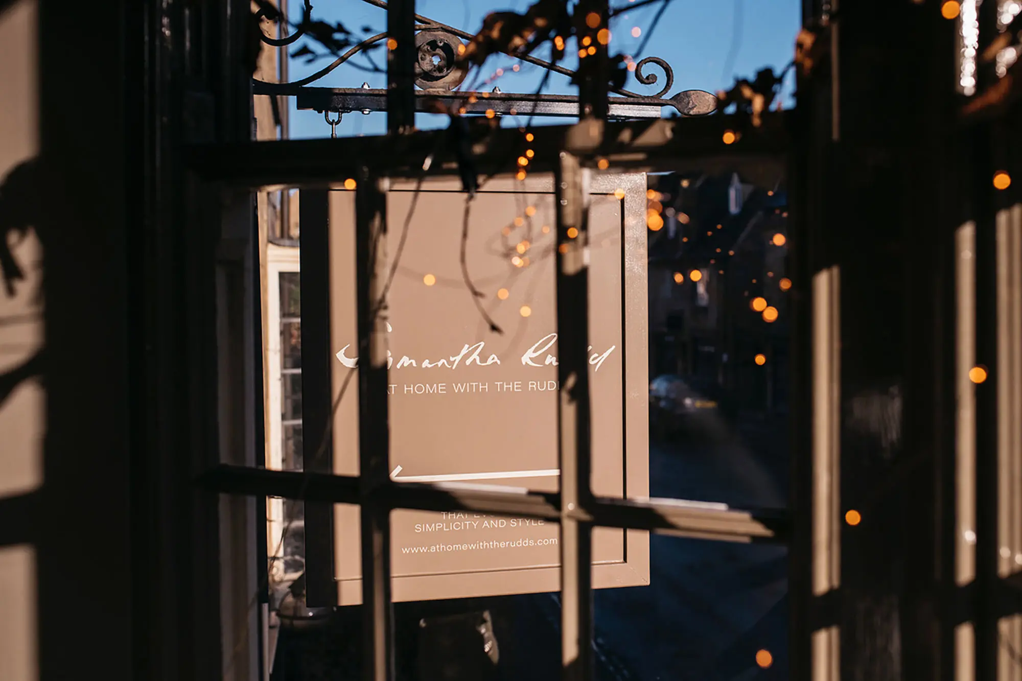
The traditional signage that set the story, carried through into the digital storefront
It was lovely to move between online and offline, and see how the story that started with the traditional signage carried through into the digital storefront. Working with sign makers and shop fitters was all new to me and a big learning experience, and my understanding of print files, colour profiles and handoffs grew a huge amount during this project.
Kate’s Storytree is run by artist Kate Coleman, who creates storytelling spaces full of colour, sketches, cuttings and props that pull children and adults into her stories. The challenge was bringing that hands on world into a website that people of all ages would enjoy.
To get a feel for what she does, I went along to one of her live sessions with my camera. I then took Kate’s hand drawn rainbows, trees and stars, cut them up, scanned them and animated them across the site.
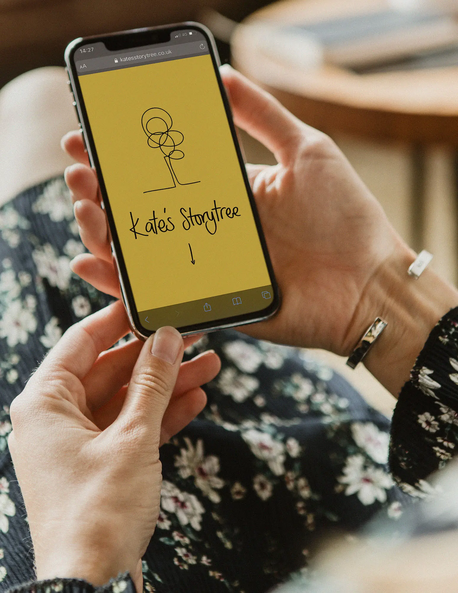
A site built to be easy for Kate to manage, so she can focus on telling stories
The finished site is fully responsive, with bright colours, bold fonts and a cut and paste feel that matches her sessions.
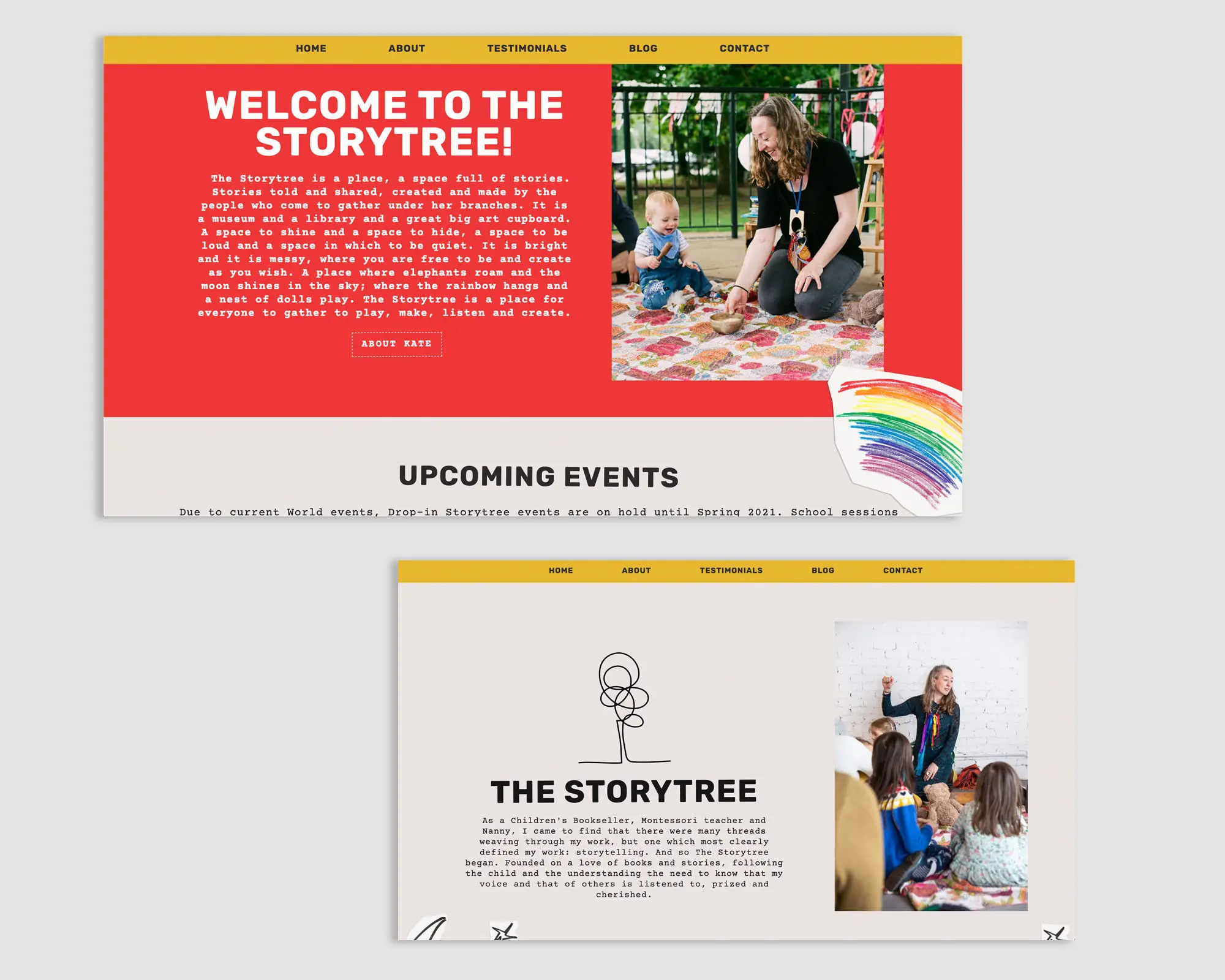
Kate’s own drawings, cut up, scanned and animated across the site
Just as important was getting the basics right. I fixed Kate’s email, which had been a real headache for her, made sure contact forms went to the right place, and kept the site easy to manage, so she can focus on telling stories.
Kate was pretty sceptical about tech when we started, so this one meant a lot to me. Seeing her go from dreading anything online to having a space she was genuinely proud to share with families was one of the most rewarding things I did as a freelancer.
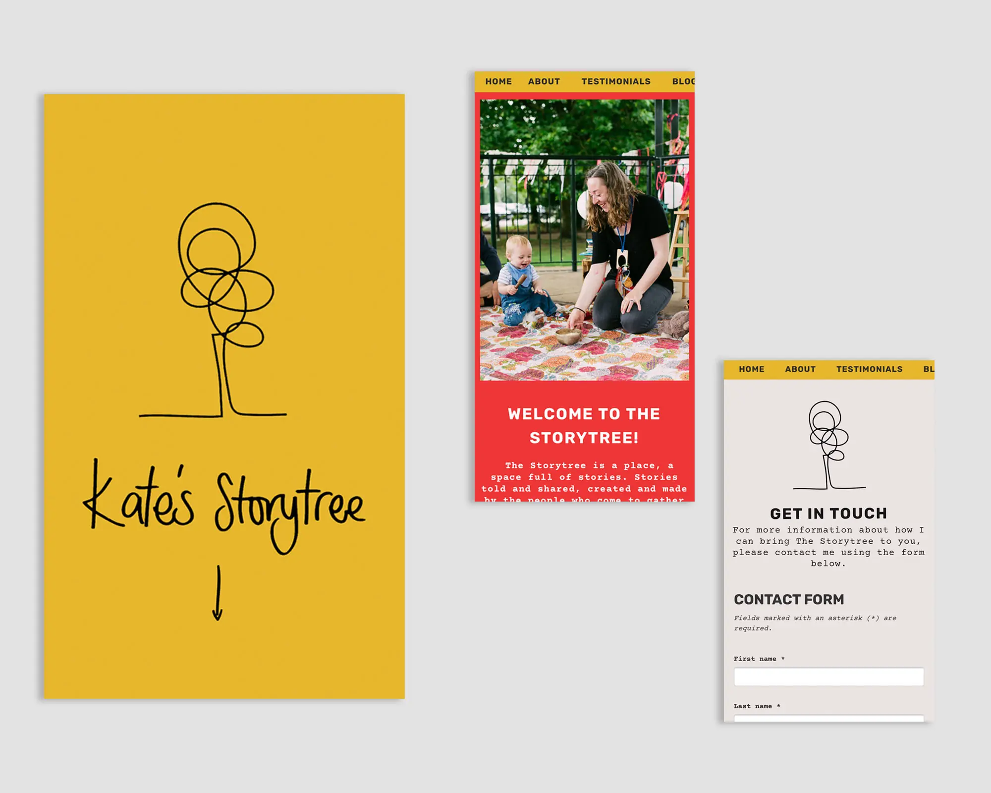
A space Kate is proud to share with families
With all three, I worked the same way. I spent time in each business, usually with a camera, turned what I found into a brand and website that felt like theirs, and made sure the practical side just worked, so they could get back to what they do best. It’s where my UX journey started. I was on site, talking to customers and business owners, and building sites that felt true to the world they’d created rather than handing over a generic template.