Our nine product teams were each building their own components, which slowed everyone down and created a fragmented experience for users. Our devs work across Angular and Blazor, and Blazor had the least support, so I built that side of the design system directly in code, then grew it with a team of ten developers.
Every team had their own version of buttons, tables and forms, so nothing looked or behaved the same and devs were rebuilding the same things over and over. For users, it was a bit of a mess. Someone moving between picking, packing and returns had to learn new patterns in every app, which slowed them down and made mistakes more likely. For me, that was the biggest thing to fix, and fixing it would help everyone straight away.
It actually started life in Notion. I documented components and guidance there, but I struggled to show decent examples, and handoff to devs was still a lot of back and forth. I spent a while trying to make Notion work before admitting it wasn’t the right tool, and that’s what pushed me into code.
Our devs are split roughly half and half between Angular and Blazor. For the Angular teams, I introduced Storybook and they really ran with it, building and documenting shared components there themselves. Adoption on the Blazor side was much lower, so that’s where I focused.
I built a whole design system in Blazor on my own in VS Code, using GitHub Copilot and learning as I went. It was a great intro to coding with AI support. It let me move much faster than I could have otherwise, and I learnt a lot about how components actually behave in code. Rather than handing over Figma files to be translated, the components were ready to drop into projects.
As the only designer across nine teams, I couldn’t be in every conversation or design every screen myself. The design system is how I manage that. Teams can build most screens from the components and patterns, with a lot less input from me, and users get the same experience wherever they are. That frees up my time for the trickier problems, new patterns and user testing, rather than redrawing the same table for the ninth time.
One designer, nine teams: the system lets teams build screens with less of my direct input
We called it Palettes, a mix of colour palettes and the pallets you’ll find all over a warehouse. Both sides live there. Angular teams use the shared components, with documentation in Storybook linked from Palettes, while the Blazor side is built around copy and paste code snippets. Every component links to its Figma file for a deeper look at styling and implementation, alongside our source of truth theming files, so devs can start with out of the box components.
Once the business saw the value, they let me put a proper team together. It now has developers from each of the nine product teams contributing, split into Blazor and Angular sub teams. I already had good relationships with these teams, which made it work well, and each area has someone who really cares about it.
A big part of it was giving devs more responsibility and ownership. Rather than me being the bottleneck for every component, the team owns the system, makes decisions on it and keeps it growing. It’s shaped by the people using it rather than forced on them, and that’s a big reason it’s stuck. The developers understand their own team’s requirements, and they go back to their teams knowing exactly how to apply the system.
Palettes covers the foundations too, so things like colours, theming, typography and spacing all live in one place. Before this, colours were picked by eye and every app had its own slightly different shade of everything. Now each colour is a named token with its light and dark values side by side, so devs never have to guess a hex code, and there’s a light and dark mode built in. Spacing was a big one for us. Our screens are packed with data, so keeping margins and padding consistent is what stops them feeling crowded. I showed it on real screens rather than just listing numbers, so it was easy to see how it all fits together.
Accessibility is built in from the start rather than bolted on at the end. Every component is checked as it’s built, and we’ve run testing sessions to make sure it holds up in practice.
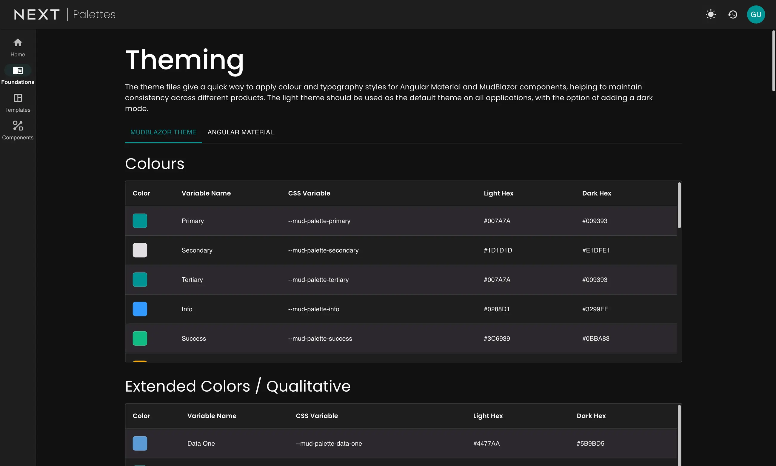
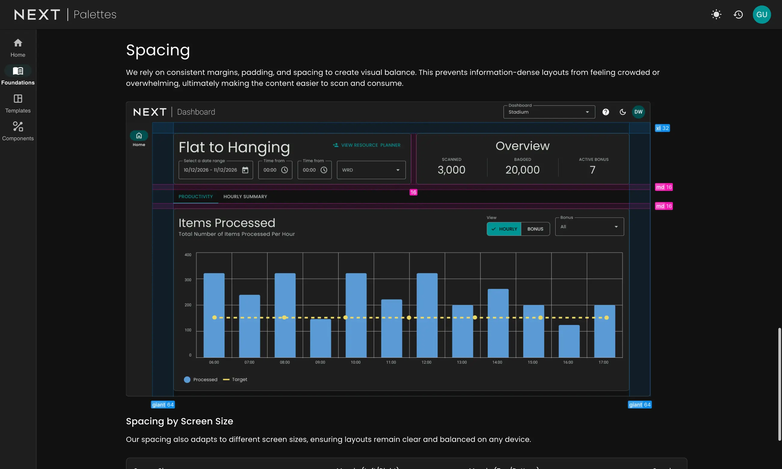
Theming and spacing, the foundations every team builds on
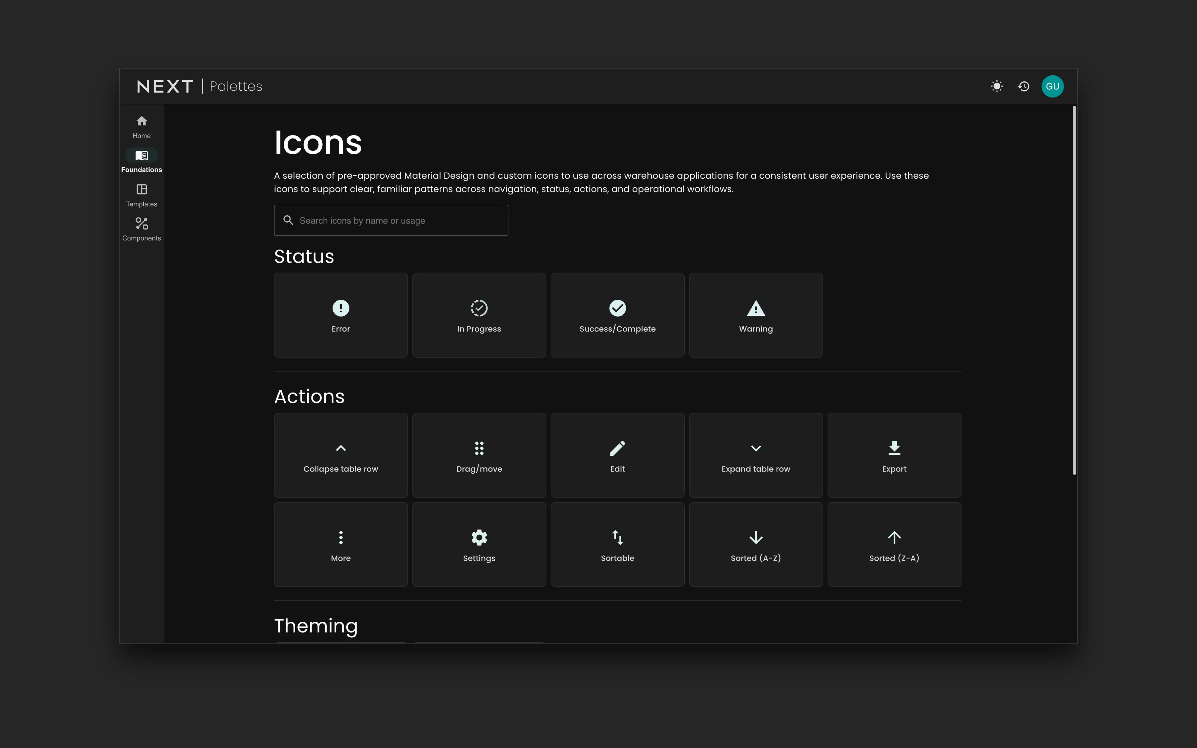
On the Blazor side, every component comes with live examples and the code to go with them, so devs can copy it straight into their projects and see what’s already there before building something new. There’s a shared icon set too, so the same action always looks the same wherever you are. It sounds small, but when someone moves between apps all day, things like an edit or export icon being in the same place really adds up.
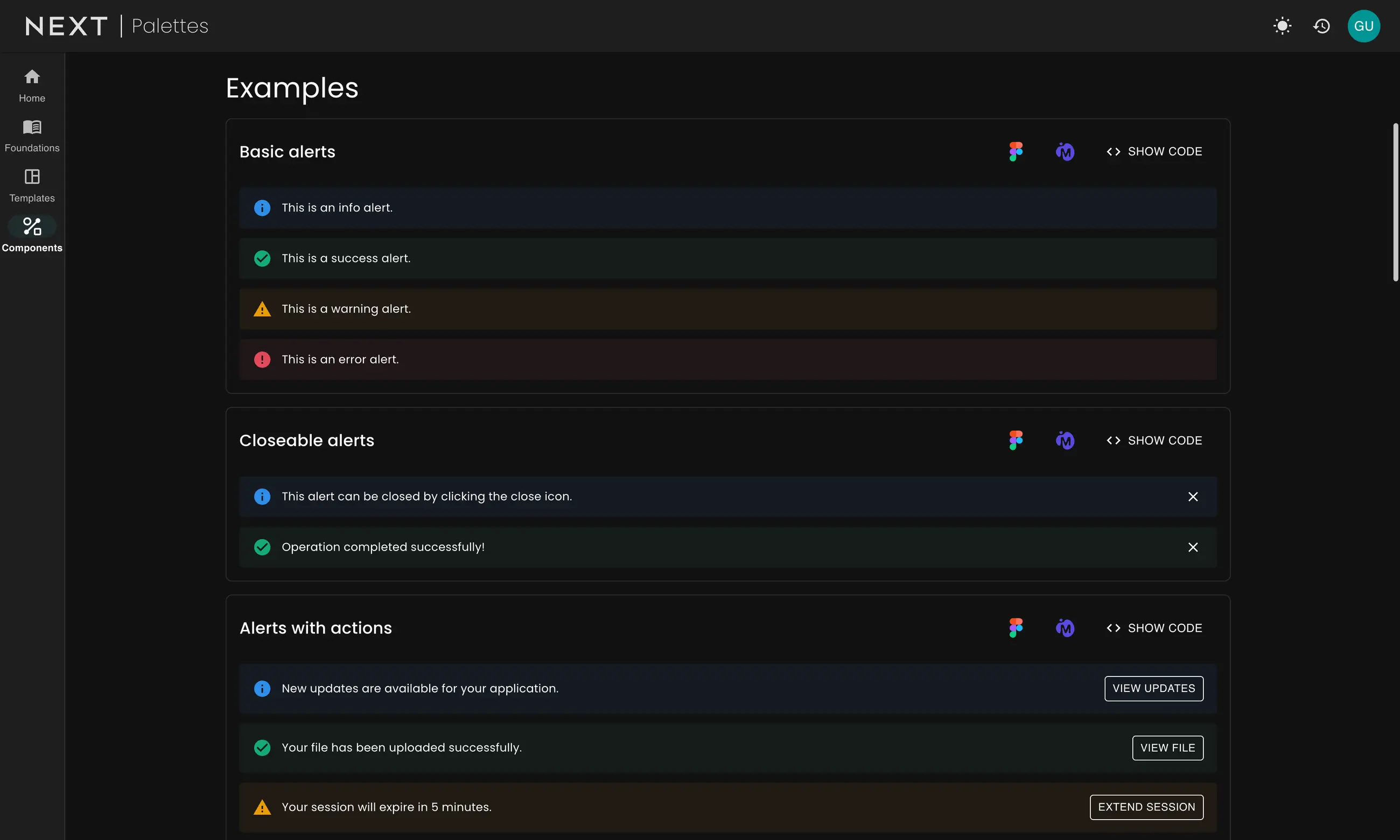
Alert components with live examples and code
Each component comes with guidance on when and how to use it, so teams can make good decisions on their own. We put together simple decision flows to help teams pick the right component, like deciding between a dialog, an alert or a snackbar depending on how much attention the user needs to give.
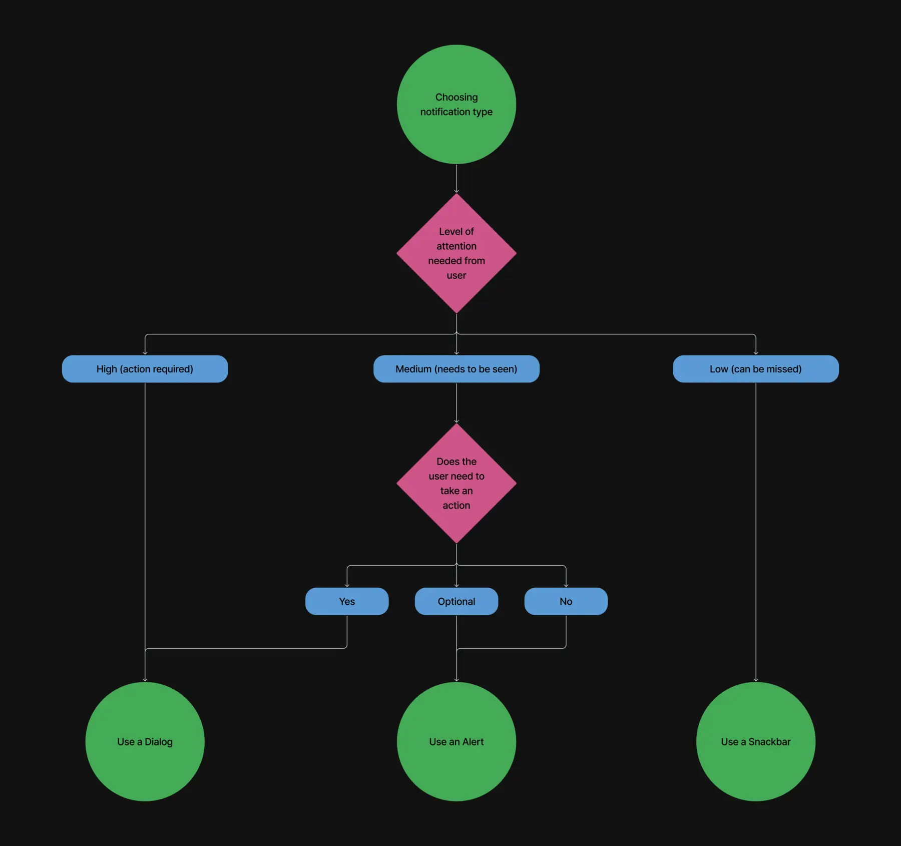
Guidance for choosing the right notification component
It’s grown from there too. I built a playground that Product Owners can use to see how their requirements could work with pre built components, without needing Figma or a developer. A growing number of our workflow users are also building their own screens with AI, so I’ve started supporting them as well as the devs. Palettes Lite is a smaller, simpler version of the system made for them, so the screens they make still look and work like the rest of our tools.
Outside of my own work, I’ve pushed for AI to be used more across the teams, and I’ve run presentations on how to bring AI into design workflows. It’s helped me learn new frameworks quickly and actually build with them, which means much better conversations with our devs. More and more, I’ll start in VS Code to get a feel for an application before refining it in Figma.
For the first time, all nine product teams are building from the same design system, whether they work in Angular or Blazor. The devs own it, with a team of ten keeping it growing. The playground and Palettes Lite have opened it up beyond design and development too, from Product Owners to the workflow users building their own screens. It’s made a real difference to delivery, with teams seeing up to a 50% reduction in story estimates now they’re building from ready made components, and accessibility is baked in rather than left to each team.
Building the system on my own first, then handing it over to a team of ten, sums up how I like to work. Start small, get it in front of people quickly, then build the team and structure around it so it sticks. I’m a big believer in making things to understand them, then pulling them apart and refining.